Today, I am wading back into the Silmarillion to bring you widespread panic, epic conflict, devastation on a cosmic scale, and hopefully some interesting Photoshop tips.
The scene I am working on for this two-part series is of Melkor (now named Morgoth by a furiously angry Feanor) and the taking of the Silmarils. This is a global catastrophe for pretty much everybody in Middle Earth, except perhaps for Balrog real-estate agents. And we see all of this against the backdrop of the specific anguish of Beren, who has returned to see his homeland of Doriath burned in the battle of Sudden Flame. The goal of this composition is to collapse both these small and large concepts into a single image.
I always start these images as scrappy little ink drawings, which I have enlarged here, but really, they are just scraps of barely legible lines. From these I pick the one that strikes me the most and wrestle it into a photoshop file.
Quick tip: When making your early conceptual file, it helps to know what size you want it to eventually be. Going for a 16x20 painting? Go ahead and drop this composition into a file size of that dimension. It will save you headaches later.
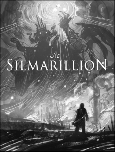
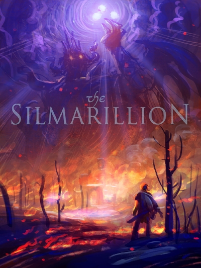
Now that I know generally what my composition will be, I do some exploring. First, a quick monochrome pass in Photoshop to clean up and enhance my scrappy little ink drawing. This is very important as it establishes the lighting effect for the image. Line and value is the intellectual statement of an image, while color is the emotional. So for the feels I lay in some basic colors (in Photoshop) as my target for the final image.
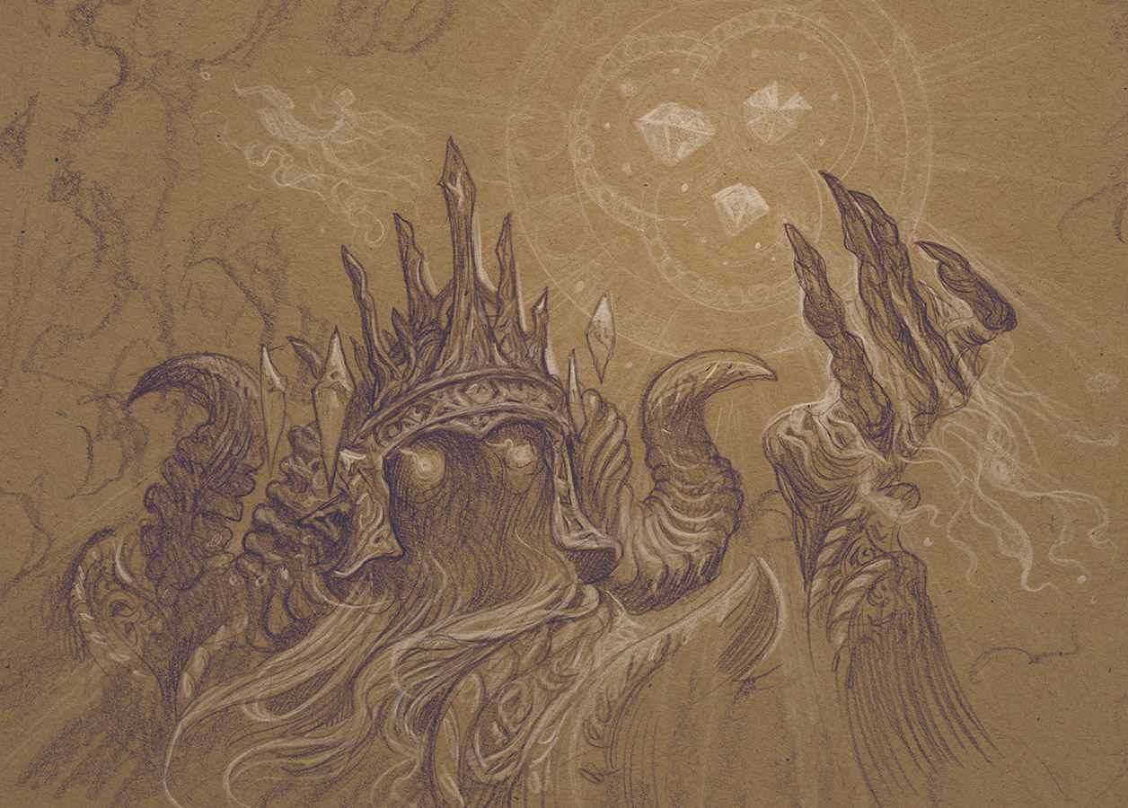
After arriving at a color comp I am happy with I do studies to really flesh out some of the key elements in the image. I am not very rigorous about how I do these. I just start grabbing whatever paper or cats are around to draw these on. In this case I wanted to try out a new Daler Rowney drawing paper with a few Caran D'ache Pabo pencils.
Morgoth's design proved initially very tricky. I liked him as a shadowy menace with only eyes in the color comp and this seemed to serve the narrative of the scene the best. But I also really want to draw an ancient, seared, withered, angel-elf, demi-god face. (It would just be fun! I shouldn't need more of an excuse! And you're not the boss of me, I can do what I want!) ... After trying several versions with his face clearly visible in the composition and even giving the image the overnight test I realize that I just have to murder my darlings ... and went back to the shadowy figure. (I'm still going to do an image with that face in it at some point though and you can't stop me!)
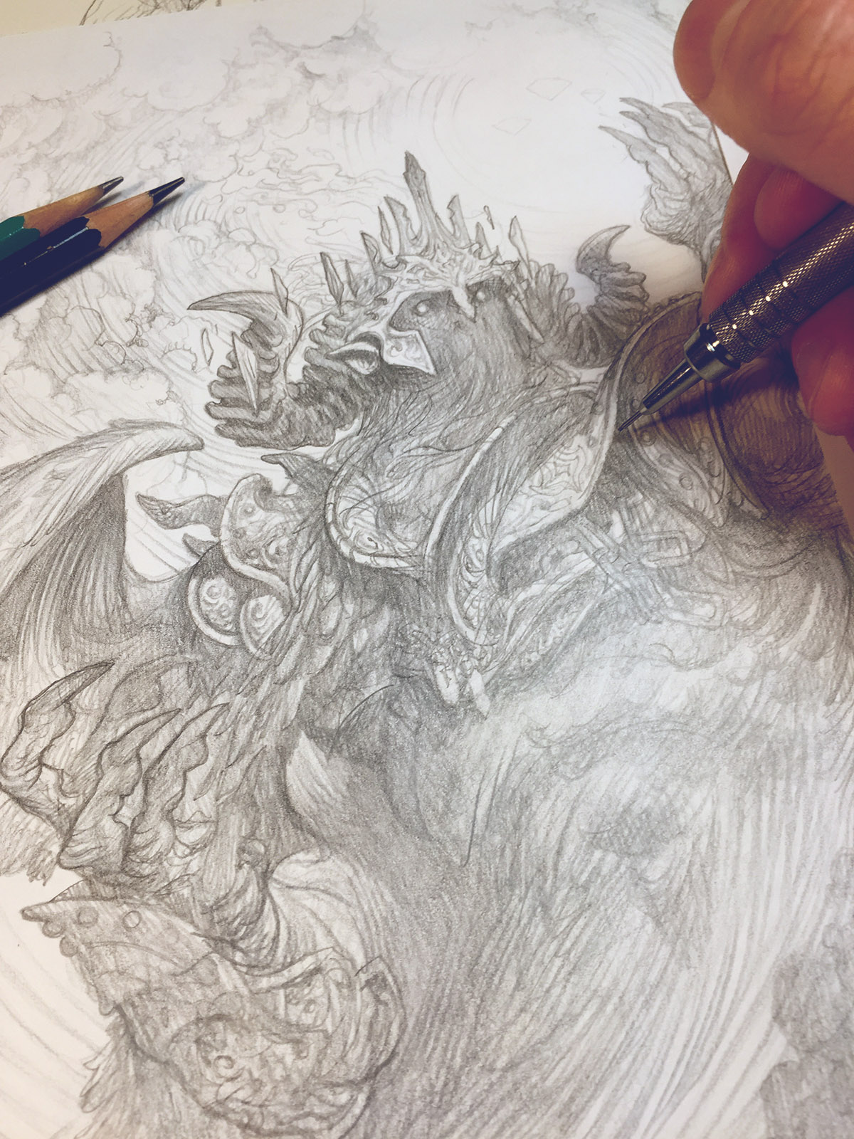
Now that I've finished with all this over-wrought, preliminary procrastination, I finally begin the tight drawing. For this drawing I use lightweight bristol paper. For pencils I am using Prismacolor Turquoise pencils (an old favorite of mine) for the murky shadows, and a mechanical pencil for the detail-work. I use a small tablet light table to do the transfer.
In Part 2, I will be covering the digital painting of the image. For colorizing this image I will be doing something a little different than I usually do. First, I will be using more opaque layers and Photoshop's blender brushes. Also, instead of working from a neutral mid-tone towards a fully saturated image, I am going to be starting with a dark and highly saturated base and painting in grays and complimentary colors to slowly work the image towards the color comp. It's a bold move. Tune in next time to see how it plays out.
